A landscape photographer's main aim is shooting good quality images, they have to be sharp and detailed and taken with a tripod for double the accuracy and in a wide angle so they get a more wide spread image which adds depth to it were as a music photographer doesn't have to worry about quality or sharpness all they need to worry about is the content and conveying the right aspects of the artist as lighting is such a limitation, if the lighting is too dark the photographer has to change the settings on the camera so much; high ISO and slow shutter speed which makes the picture quality low and causes blurry, motion filled images and since the photographer doesn't have a choice at live performances about how the lighting is they just have to make do. They're jobs are also to make the landscapes look good and make the artists look good. On the other hand though I suppose a landscape photographer could also be aiming to make the landscape look bad all they'd have to do it photograph bad looking areas and edit them optionally to make it worse.
Analyzing visual language;
Eugenia Maximova photography: Of Time And Memory.
The strongest visual element in these images I'd say would be the vintage tone and content. Their images are bright and warm, very detailed, mature, dream-like, almost as if like a memory. The message the images seem to convey is that of a past life, how times have changed. The idea behind the set is an attempt to refresh recollection from the photographers childhood an to better understand the power and the meaning or an era. I feel that the most important factor of the images is the content and what the images look like because together they both create this idea of a memory and a past life which you can get without needing to read the idea. The imagery helps create the mood/emotion with its home-like feel, it's happy, bright and warm tone which gives the effect of dream which then makes you feel nostalgic but then you realize that there seems to be something missing from the images; habitation, which gives off a massive serge of loneliness overall.
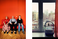
Oksana Yushko; Inside/Outside.
The strongest visual element in these images is the honesty of them and how genuine they seem to be. I find these images striking, emotional, bold and honest. The message the images convey is what people are like/what their lives are like and how this is reflected inside and out- shows the things you don't normally see about people/a person. The idea behind the set is "The city is the people." "make habitations in their own image and likeness." I think the most important aspect is the content and the second perspective from out the window because without the second shot the set wouldn't be as emotional and without the honesty of the subjects within it wouldn't be as striking and this is exactly how the emotion and mood is set; by the honestly of the people and the matching window shot which also tells us so much about the subjects.
The difference between the two photographers work is that one is set up to be like a dream or a memory whilst the other is of current time, the dream-like set features no people, just objects whilst the others main feature is the people. The 1st set is cropped into a square format whilst the 2nd set is portrait, rectangular which could be another aspect which creates the difference between realistic and the dream-like.
The similarities between the two photographers work are that they are both very emotional sets but of course done in very different ways. There both straight forward and honest as there is no hidden second message behind them or anything you need to figure out; the images are very open and are free for your eyes to explore without confusion. The images both set/create a very strong and effective mood/feel.


-730284.jpg)


No comments:
Post a Comment