Monday, 30 April 2012

TOM. Street photography with a narrative.

We had to go out and take pictures that showed a narrative of our choice, then choice three final images to make into a set that showed the narrative the best; I choice to "Construction In Leeds" as my narrative and this is my final set of three; 

1) 
2) 
3)

I picked these three images out of all the rest because they all have very strong leading lines and shapes,  they suggest the contrast of a builders job; how most of the time their jobs keep them busy and its complex but there are times when its not as challenging as the images show activity, complexity and power. The images also work together to show a narrative of how Leeds is being rebuilt again after the recession. 

1: I feel its really strong even though there's not much going on it- it stands out from the other two images in the set because its less frantic compared to the others two, there's a distinct subject in it which the viewer can soak into it and explore whilst the other images have so much going on in them and so much to take in which is why I like them so much because the viewer will never run out of things to look at within the photo. What I'd do differently is 

2: out of the three images I prefer this one because of how much shapes, lines and linking there is within it- I love the abstract edge it has and the boost of colour that seeps through and continues throughout the image. What I'd do differently though is crop the fence out of the shot a little bit more and stand back and take the shot from further away so the buildings bring/lead the eye more into the image at a more wide angled shot which would emphasizes the details within the image. 


Sunday, 29 April 2012

TIM&TOM. Location techniques shoot.

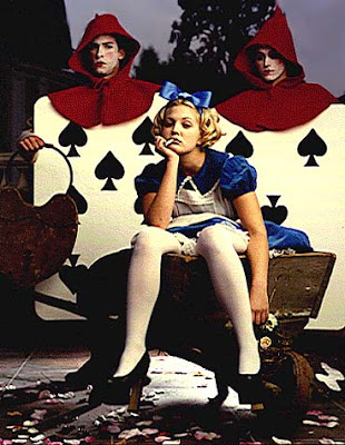
due to weather and money setbacks/problems I had to change my Alice In Wonderland idea. Instead I did a shoot in my friends house; 


- lighting.
for the lighting I had available- three artificial lights above the subject and two small windows in front and at the side of the subject bringing in natural light - I adjusted the artificial lights so they were facing the wall creating a spotlight effect- at first I only had one of the lights facing directly onto the wall then I moved one to face one side of the wall which had less lighting touching it,  I had adjusted the natural light coming into the room by moving the curtains to allows only half of the natural light to stream through.
I also used a buffet so I could stand above the subject as he was taller then me and I was limited in angles. 


- I did a white balance by making my model hold up a piece of folded paper up towards the lights above him to check to make sure the white balance was set correctly.

Final images from the shoot;


colour / black and white. 
  Final set of images I decided to turn black and white so the contrast in the picture would be balanced, the skin tones would seem to be more even as when in color the lighting was making the skin tones of the subject odd and less aesthetically then when the images are turned black and white- I'm not 100% sure about the black and white coloring though doing this has taken away the boldness of the photos and the colours were so bright it seemed a shame to have to loose them (will include some color images I took as examples of this). I also tried to change the background on one of the images I thought the smudged effect gave something extra to the image and made the subject stand out more but my tutor thought it distracted from the subject so I put that idea to the side. 

I had a hard time getting lighting right, dead eye/s is common in most of the photos I took, this is mainly because of where the lights were pointing and the subject having there head facing too forward for the light to get into them- but this was unavoidable as when I told the subject to tilt there head up they'd look uncomfortable and awkward which was not what I wanted my final images to be like.  

If I had to do this shoot again which I'd be happy to do and try to get better shots with- I'd try to include another source of light like a lamp- I'd try out the extra light; lighting up the subject and then lighting up the background and see what differences it makes and continue the shoot depending on which has the better result. I'd try a different part of the house too-this room seemed to have the most adjustable lights and a good background I was unsure if there was another room that I could adjust as well so I shook to one room which I regret now if I'm honest.

Tuesday, 24 April 2012

TIM. Alice In Wonderland themed test shots/ideas.

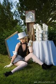
I did some test shots/idea shots for the Alice In Wonderland theme, my main focus here was to represent some main factors about the tale into the pictures.  I used a tripod and I held up a bed sheet behind me to take these pictures as I couldn't leave my room due to the horrid weather. I bought some playing cards and used a real rose and a fake one, a black ribbon and two different types of outfits with black and white tights in order to create a kind of Alice feel to the images. I tried to turn the real rose red on Photoshop but I couldn't manage it. I think if I'd of had a model to pose instead of myself I'd of being able to do a lot more with the shots but as there only test shot and to get the ideas flowing I'm happy with them.  

I prefer the images which have a person in them more because it gives the pictures depth and more to look at and take in, also it gives off the theme a bit more than the image of the items. 


Monday, 23 April 2012

TOM. Photographing Contrasts.

In this lesson we went out and took photos of contrasting areas of town. We had to photograph certain objects/"markers" of that area and find a comparison to photograph, we could make the comparison obvious or completely different to each other but it had to have a clear contrast between them. 


In this photo I wanted to photograph the difference between the cheaper shop compared to the expensive shops- I first took the 1st picture of the 99p shop sign and decided I wanted to do the same with an expensive shops sign too, an obvious approach to this comparison. 


This picture is one of the most differently compared pictures I took of inside of Leeds Market compared to the inside of Harvey Nichols- the only real similarity is the use of flags hanging from the ceilings but theres even a difference in quality between them too - this is why I love this comparison. You can see the roof of each area; the stain glass vs the cheap,bulky beams and also the main contrast of how many people are in each area; a lot vs none which highlights the money crisis were in. 


This picture is another obvious comparison, between old and new cameras- old cameras are being displayed in a shop window nowadays rather then being used like the new cameras are- a symbol of how what once was a break through for photography is no longer considered anything but a decoration.  I love the reflection of the floor in the new cameras lens too. 

STEVE. Experimental Photography; Joiner photography.


TIM. Point of view research.