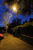
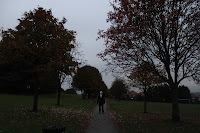
I feel that the second shoot went a lot better results wise for the images, I knew what I wanted to complete the set and I found loads of new locations which I preferred; particularly the overgrown ginnel and the ginnel which had a lighting which I absolutely loved; it was almost like a spotlight on where I'd placed Slender Man and with the surrounding scene being darker it contrasted really well to make a lighting which really stood out; it created a really moody/dramatic feel to the image which most of my other images lacked which is why I liked it so much; the location lighting had gave me the thing I'd being missing in half of my shots. In some of my shots I took the saturation down so that the colours were more of a dull shade I thought of doing this in reference to Julia Margaret Cameron's dead pan portraits; with the dull and lifeless colours of her images but I've used it to suggest that where ever he is he has a presence that effects the whole of the surroundings around him; I think that the images with the saturation down are a lot more effective than the images where I haven't changed the saturation because it suits the style of my images more.
I did another edit of the black and white shadow image because I needed a colour version of it to fit in better with the set; I prefer the colour image compared to the black and white one because the colours are more complimentary to the feel of the image, the colours make it more realistic too which is really effective in this shot. I'm still unsure about how it sits with the rest of the images; it's content and idea is different and the colours and format(landscape) are still different too. This may be a good thing though on another hand because it makes the image stand out from the rest completely; so this could be literally my "stand out" image from the rest of the set.
Because of taking one image on the first shoot in landscape form that I really want to use for the installation I decided I'd take some more landscape form ones to see if I could balance out the set but after editing and thinking about it more i've decided to keep just the one landscape image in my set.
^ In this image I took it out of focus and found that it looks really interesting, it seems to make Slender Man even scarier because you can't see him properly in it; the blurred look to the image also fits with part of the computer game where when you see him it makes you not able to see properly and if you look for too long he turns you "insane" I may use this image in the final set because it's got a slightly different spin on it which is very effective.
Before and After; (Editing process)
Originals; Edits;


Contact sheets for the second shoot;


No comments:
Post a Comment