On the day of setting up(starting at 10 am and we had til 6) the installation I came to realise that the layout I had originally planned wouldn't have worked out right, there was difficulty setting up the boards in the formation I had planned, there was a gap that I had planned to block by using chairs and I soon found that people could easily peek round and see Slender man and spoil the whole installation so with a bit of fast thinking and working it through the final layout looked like this instead;


I decided to go with the zig zag layout because I wanted some form of walk way for the viewers of my pictures to be tension building, The zig zag layout makes it so the people walk along the lines of the boards until they reach the last image- I made it so the zig zagged points of the boards really sharp so that when you went around the corners it was more effective- this was part of my installation because I needed the viewers to be surprised/shocked when they went round the last corner and saw Slender.
My Slender model could only be there for the night of the installation opening and I got him there a bit too late, most people had already seen my images so the plan for people to walk down the zig-zag row of images, get to the end and then be face to face with Slender Man himself didn't go to plan - but he still walked around the installations in character and made quite a few people creeped out, so all went well.
And even though there was quite a run around(one section of one of my prints had gone missing so I had to go home, get my memory stick,go back to college print off the section I needed and guillotine it) in order to get my prints right they all ended up on display, of course not perfect but better then not at all. Some of the things that went wrong with my prints that I defiantly do different if I had another chance;
^ The section that I had to print again. It took up a lot of much needed time to print it off again, it was worth it but I can't help but think I could have got a few good scares if I'd of being able to be there with Slender before people saw my images.
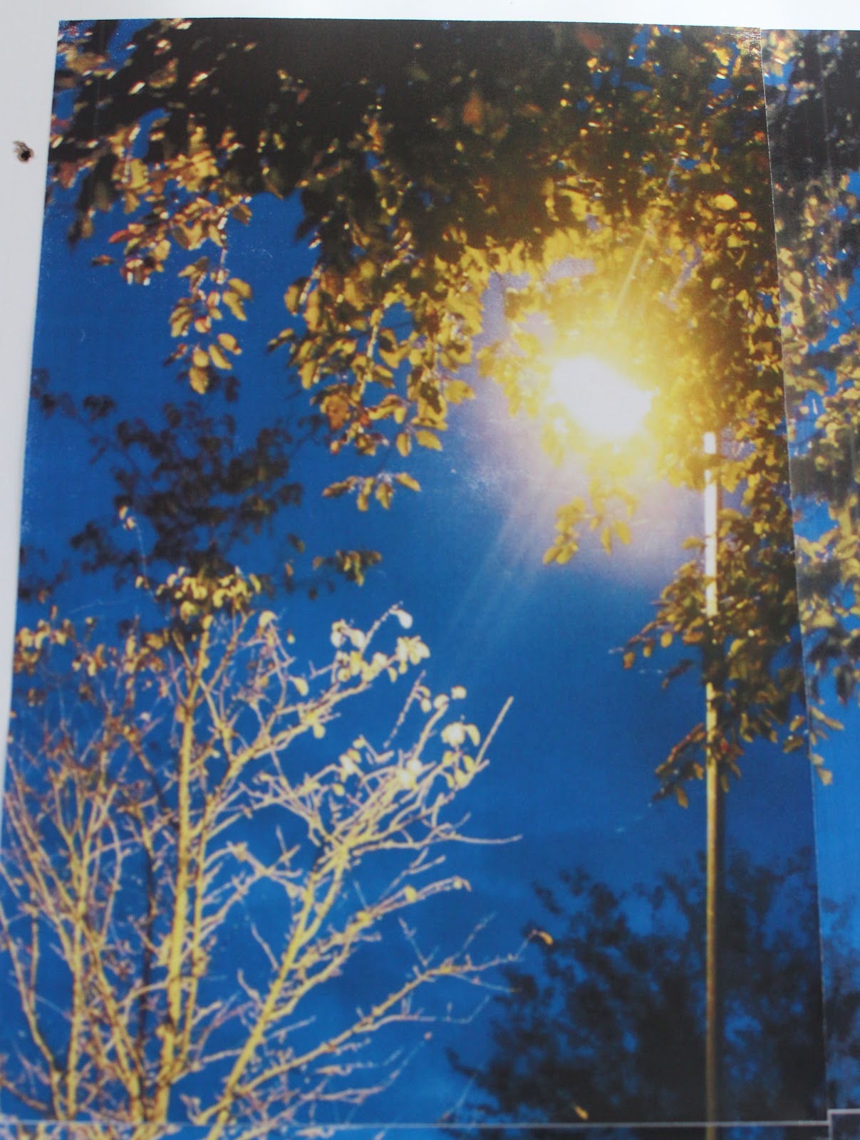
^ One of the images I couldn't line up properly because when I did it would create a gap in the middle of the two centre section prints.(I'm guessing I cut one of the images a little short with the guillotine) I thought that it added to the creepiness of the image though.
^ One of my images was cropped a good few inches
shorter when edited them, so the print was shorter than the rest.
^ Another guillotine mess up but this happened on a few images, although only slightly bigger/longer it still bugged me- I managed to sort out one by using the guillotine again though.
but aside from the little bug bears I had with the prints, they looked rather effective when you viewed them from distance and I was happy with the way they had turned out. I defiantly would have printed out the images on photo paper with a high quality if I'd of had the money too though for sure and I'd of defiantly taken more time when cutting the paper prints with the guillotine; I didn't realise how differently they'd being cut until too late.
Over all I'd of liked to have a completely different installation out come; I was fully set on my first idea of having a room with the curtains hanging down from the ceiling that created the walkway in which the viewers would walk down and take in my images, scary signs- building up tension with my soundtrack and the wait, the not knowing what's going to happen and what's at the end of the walkway. I would have loved to have an interactive installation; where the viewers would have to make their own way into a world where Slender rules; that's why I wanted the forest references, the leaves on the floor, some form/way to have trees included within it and a passage way/curtain wall they had to make their way through and eventually they'd have no choice but come face to face with Slender Man. If I'd of being able to produce this idea it would have being completely engulfing for the viewers/participators- it would have being 50 times more effective then the installation that I produced which is why I was disappointed over all; I really would have loved to stage this installation; given a room that I could hang curtains down from and a small sized room which it could be produced in. Never the less though, I think my installation was effective as it changed the emotions of the people that experienced it, the images were big and bold so they stood out, I made my installation come to life with my Slender Model walking around the room that was successfully noted performance art and the performance art scared people too. I am happy with how my installation turned out; it fulfilled it's purpose fully but there's just a little part of me that wishes I could have produced something more like my first idea; a full-room installation that put the viewers in a completely different "world" but at the end day the main focus I had was to bring the Slender myth to life and did thus my installation was a success.
Installation aside; I think my final images worked well as a set; I made sure to display them in a layout that showed Slender man was getting closer, not hiding in the settings as much. I also paired them in twos that I thought fit best together; The two darkest/moody, the two that were in relatable places and the two that were out in the open on streets that just so happened to be the most colourful and bright.