Caravanning magazines...
Both these different caravanning magazine are quite chunky and made with glossy front and back covers. The layouts in both seem to follow the same sort of theme; lots of writing and information to read, lots of advertisements and images. Some pages have big images where they take over the whole page and other pages have more writing and a few images placed around the small print writing- over all I'd say that the writing and images are rather well balanced out though at times the writing load can seem over bearing on some pages. The 'Camping & Caravanning' magazine seems to have a lot more writing in it to be fair although the writing size is more commonly bigger than the print size of the other magazine. Theres nothing dramatically exciting about the layout- it's professional and grown up; clearly more of a reading for information magazine than a magazine you read for a relax although people have different opinions and likes so you never know. These magazines are both really big/long but it's a nice size as the images are more effective and overall looks better the size they are, the images are more striking and detailed.


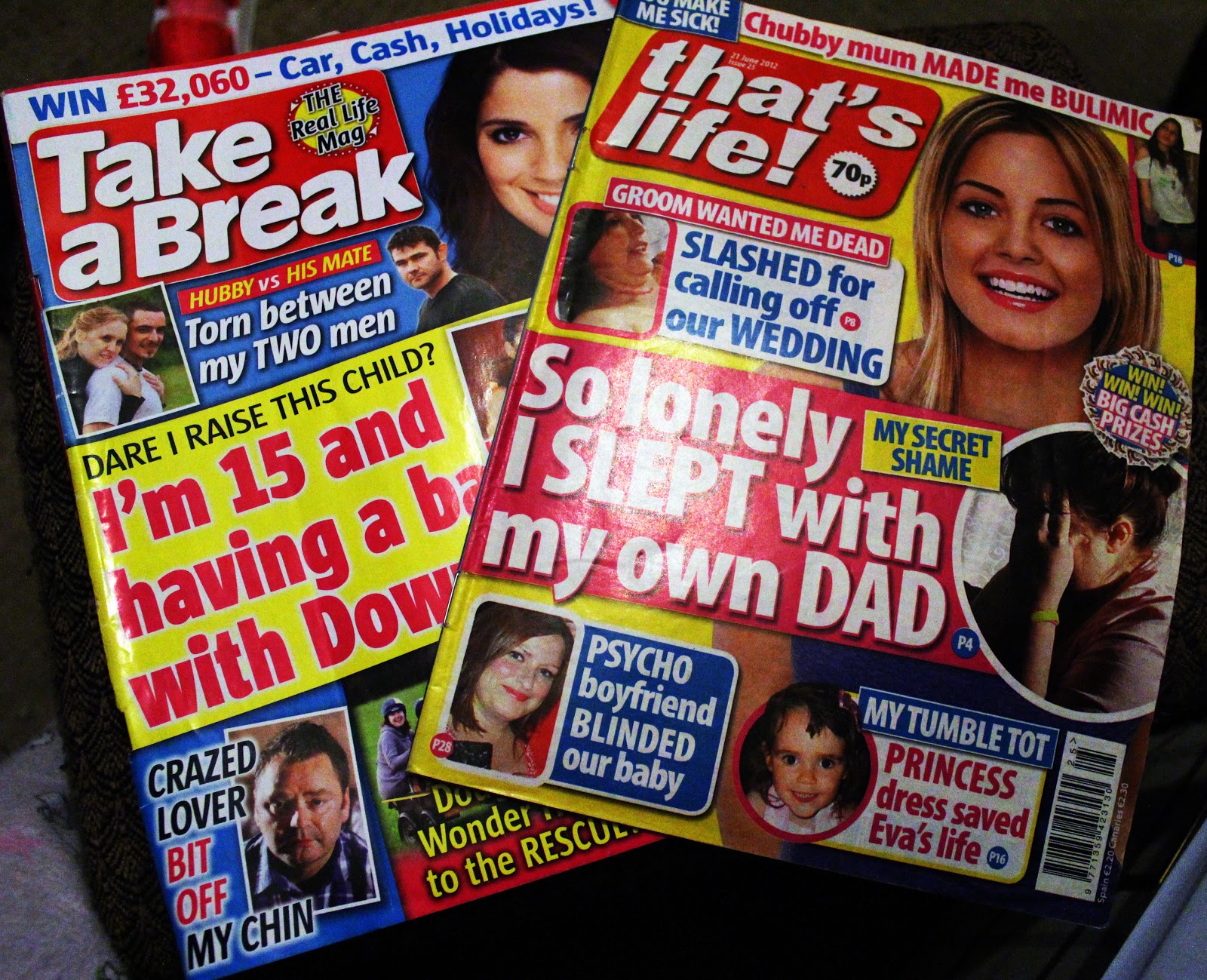
Woman's weekly magazines...
Both these magazines have overwhelming, bright and bold colours, huge fonts, exaggerated articles that are packed full of small/ medium print writing, puzzles to complete and an offer/competition for a holiday. The magazines from the covers look hectic and so do most of the other pages within in them other than the article pages which seem to go by the same theme of small print writing and images and quotes placed in between across the page/s. The magazine is filled with fun and serious articles, fun puzzles and horoscopes and even fun advertisements- it's clear to see that these magazines are defiantly aimed at women and aren't meant to be taken seriously, just a bit of fun.
Supermarket magazines...
Asda: In this magazine the pages are nicely balanced out with big images and easy to read text that proves education as well as fun which I'm guessing is the edge they were going for. The font's used are soft and round, not intimidating at all and matches the relaxed feel to the magazine. The Front and back page of the magazine are not the same paper as the insides of the magazine which I think is a nice touch, it makes the magazine seem more expensive a look more professional and it also nicer to handle as it feels less rough as opposed to the Sainsbury's magazine which has the same paper used throughout the magazine. The layout of the Asda magazine is sometimes a little more inventive then on other pages which keeps it entertaining to read matched with the bright colours(that aren't too overwhelming) but overall the layout is quite simple, easy on the eyes and aesthetically pleasing. The magazine features articles on food, interiors for the home, fashion,charity work/fundraising, Entertainment(films,movies,books) and health- the magazine is clearly aimed at mainly women and families.
Sainbury's: This magazine is defiantly a lot thinner than the Asda one(I'm not sure if is for practicality or more for saving themselves money). The layout and style of the magazine is more of a plain, clear and simple for the most part of it- within the last sections they mix things up a bit more by using bigger and more fun coloured fonts but other than that there pages are classic white with black writing and the old slash of colour here and there on the pages. As for the articles; in a rather small print and there is a fair bit more writing on each page compared to the Asda magazine; the articles are about shopping at Sainbury's, food & drink, living and offers. So there is less topics but more to read on the pages.
All three magazines are a handy small size.

Research on Magazines;
- Art Magazines.
- Zines.(most commonly a small self-published work of orginal text and images.)
- Online magazines(printed only online, may also be call "Luxury magazines" but they only purpose is marketing high-value products.)
- News magazines.
- Pulp magzines.(inexpensive fiction mags that were cheaply made through 1896-1950's)
- Trade magazines/journals.(Marketing of a trade or industry)
- Music magazines.
- Fashion magazines.
- Science magazines.
- Science fiction magazines.
- Sunday magazines(a mini magazine extra in a sunday newspaper).
- Lierary magazines.(magazines that decicate themselves to writing; articles on short stories, poetry, essys etc)
- "Hobbie" magazines. (magazines that our all about a certain hobbie/skill; boating, cars, sports etc.
- Business magazines.
- Humour magazines.
- Coated paper; Coated paper has an enamel coating, which gives it a shiny surface. The ink does not soak in to this paper, and colors and photographs appear brighter and sharper. A coated paper called C2S is shiny on both sides. A UV coating is an added chemical coating done after ink is put on paper that creates a high gloss finish and makes the magazine more durable. Varnished coating is not as heavy or shiny and is a cheaper alternative to UV. Any type of coated paper is more expensive than uncoated paper, and, unfortunately, coated paper cannot be recycled.
- Uncoted paper; Uncoated paper appears flat and is not shiny, and it does not keep ink from soaking in. Uncoated papers, which often contain concentrations of hemp or cotton, do not work as well for magazines with high-resolution photos or screens because the ink is readily absorbed into the paper. Uncoated paper is still used for magazine, especially those with an ecological focus, because the paper can be recycled.
- Sheetfed and rolled paper; Individual sheets of paper are manually inserted into a commercial sheetfed offset printer. Rolled paper comes in a large round continuous roll of paper and is typically used in a larger, often digital, commercial press. Both sheetfed and rolled paper can be purchased as either coated or noncoated stock.
- Recycled paper; Ecofriendly publishing has several elements contributing to green printing, including the use of soy-based inks. Printing on paper with a high ratio of recycled content or even 100 percent recycled material is becoming a popular option. Recycled paper is not as affordable as most other printing papers because of the process used to create it.
- weight and grade; Paper weight refers to the weight of a ream of standard cut paper . Typically, Wagazines use 50-, 60- or 70-lb. paper for the interior pages with an 80- or 100-lb. "cover stock" for the front cover. A paper's grade refers to how it reflects light. Magazines print on 3, 4 or 5 grade paper, which is often referred to as " bright," "extra bright" and "ultra," respectively.
Creative Video Research;
Where Good Ideas Come From...
http://www.youtube.com/watch?v=NugRZGDbPFU
Similar video-
Langage...
http://www.youtube.com/watch?v=J7E-aoXLZGY
2 person location/festival interview;
http://www.youtube.com/watch?v=l_FeCZSeOtE
^This video is casual, a few laughs and the interview questions are taken seriously- the interview asks both people questions, mostly together and some aimed at them each individually. Theres a lot of band-interest questions, technical questions, tour questions. The video it's self is really straight forward- the interview itself is continuous(the magazine logo is shown at the top left side the whole time and the magazine website is shown bottom right), the start of the video has the magazine logo taken over the frame and music playing, a picture of the festival's name their at and then a cut to the two members saying who they are and what "your tuning into *magazine name*" then it cuts to the full interview the video then fades off at the end to a black screen, music sudden comes in and social website links are shown and the url of the magazines website after them.


1 person, technical guitar lesson/talk;
http://www.youtube.com/watch?v=YLxDAXr4G44
^This video is also continuous, but it features one band member and his instrument, talking about how they play and how to play a certain part of one of their songs. The title screen of the video is a white background with black text of the members name zooming in, flashing then the logo of the band drops in and the name of the band is "typed" out under neath then text about the video is after it then fades to the member sat on a chair with his guitar- this is how the video is the entire time, the logo of the company filming is in the bottom right corner the whole time and when the guitarist is talking about how to play the song, the camera angle changes so that its close up on the guitar and keep alternating between guitar close ups and full shots of the member the video ends with a fade to black.


1 person (more creative) interview:
http://www.youtube.com/watch?v=e6pzh_eny2I
^ This video is more creatively put together, the person filming took lots of different shots of the artist playing and put them all together in a fast paced montage at the start of the video showing whilst his music was played over the top. the video has lots of voice overs though out whilst other clips of him playing and his guitar are shown. The interview is very casual and the question are all around his childhood, his career and his new album. The start frame of the company's logo has a voice over of the artist saying who he is and that your watching "EMG TV" the logo is placed on a green background that has movement to it which cuts to the fast paced montage and then flows into the interview with a voice over. Throughout the video lots of different camera angles, transitions and video effects are used and it's constantly cutting between the interview clips and voice overs which makes the video a lot more entertaining then just constant interview clips. The company's video logo seen at the beginning is shown on the bottom right the whole time and the last frame shown is of the website you can buy their pick ups from.


whole band casual none-serious interview/live and filer clips:
Similar video-
Langage...
http://www.youtube.com/watch?v=J7E-aoXLZGY
Band Video Research:
2 person location/festival interview;
http://www.youtube.com/watch?v=l_FeCZSeOtE
^This video is casual, a few laughs and the interview questions are taken seriously- the interview asks both people questions, mostly together and some aimed at them each individually. Theres a lot of band-interest questions, technical questions, tour questions. The video it's self is really straight forward- the interview itself is continuous(the magazine logo is shown at the top left side the whole time and the magazine website is shown bottom right), the start of the video has the magazine logo taken over the frame and music playing, a picture of the festival's name their at and then a cut to the two members saying who they are and what "your tuning into *magazine name*" then it cuts to the full interview the video then fades off at the end to a black screen, music sudden comes in and social website links are shown and the url of the magazines website after them.


http://www.youtube.com/watch?v=YLxDAXr4G44
^This video is also continuous, but it features one band member and his instrument, talking about how they play and how to play a certain part of one of their songs. The title screen of the video is a white background with black text of the members name zooming in, flashing then the logo of the band drops in and the name of the band is "typed" out under neath then text about the video is after it then fades to the member sat on a chair with his guitar- this is how the video is the entire time, the logo of the company filming is in the bottom right corner the whole time and when the guitarist is talking about how to play the song, the camera angle changes so that its close up on the guitar and keep alternating between guitar close ups and full shots of the member the video ends with a fade to black.


1 person (more creative) interview:
http://www.youtube.com/watch?v=e6pzh_eny2I
^ This video is more creatively put together, the person filming took lots of different shots of the artist playing and put them all together in a fast paced montage at the start of the video showing whilst his music was played over the top. the video has lots of voice overs though out whilst other clips of him playing and his guitar are shown. The interview is very casual and the question are all around his childhood, his career and his new album. The start frame of the company's logo has a voice over of the artist saying who he is and that your watching "EMG TV" the logo is placed on a green background that has movement to it which cuts to the fast paced montage and then flows into the interview with a voice over. Throughout the video lots of different camera angles, transitions and video effects are used and it's constantly cutting between the interview clips and voice overs which makes the video a lot more entertaining then just constant interview clips. The company's video logo seen at the beginning is shown on the bottom right the whole time and the last frame shown is of the website you can buy their pick ups from.


whole band casual none-serious interview/live and filer clips:
http://www.youtube.com/watch?v=lHM6QHK7iO0
^This video is definatly more casual out of all of the videos so far, the band don't seem to be taking it seriously at all from being still hyped up from the concert they just played- the video shows ,more personally of the band and its member more than anything. This video features some filter shots such as the crowd queuing and it features a clip of the band playing live from that night. I think the video uses too many titles to be honest as you can see below. The live clip get reused for a "special thanks to.." section in the video and the font used makes it look tacky and unprofessional. The questions asked don't matter because every question that gets asked the band don't really answer properly they just joke about it and get distracted and mess around. This is the main reason why I don't really want a whole group interview with the band as I know for certain almost all of them won't take it seriously.


^This video is definatly more casual out of all of the videos so far, the band don't seem to be taking it seriously at all from being still hyped up from the concert they just played- the video shows ,more personally of the band and its member more than anything. This video features some filter shots such as the crowd queuing and it features a clip of the band playing live from that night. I think the video uses too many titles to be honest as you can see below. The live clip get reused for a "special thanks to.." section in the video and the font used makes it look tacky and unprofessional. The questions asked don't matter because every question that gets asked the band don't really answer properly they just joke about it and get distracted and mess around. This is the main reason why I don't really want a whole group interview with the band as I know for certain almost all of them won't take it seriously.


1 person interview:
http://www.youtube.com/watch?v=QLHejmzi56o
No comments:
Post a Comment